Jardah Fish - Branding & Identity Design
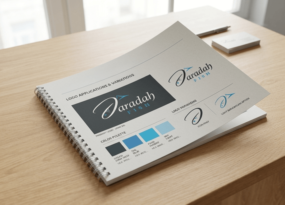
This branding project was created for a fish trade company looking for a clean, memorable identity that could be applied across multiple touchpoints - from packaging and uniforms to delivery vehicles and digital use. The work was originally developed through an online design platform, based on a client brief describing their business, values and preferred visual direction. The final identity was designed to be simple, distinctive and versatile, forming the foundation of a cohesive brand system rather than a standalone logo.
The Approach
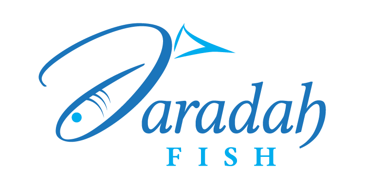
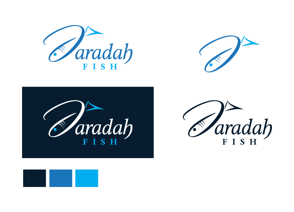
The core idea behind the identity was to create a symbol that felt modern and directly connected to the company’s maritime focus. I explored several visual directions, including stylized fish shapes, wave-inspired forms and geometric compositions. The selected concept incorporates a fish-like silhouette shaped into the letter J, giving the mark a dual meaning - a recognizable initial and a subtle reference to the company’s trade. This approach ensured the logo could serve as a strong anchor for a broader brand identity, maintaining clarity, personality and scalability across different mediums.
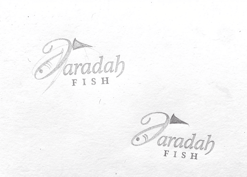
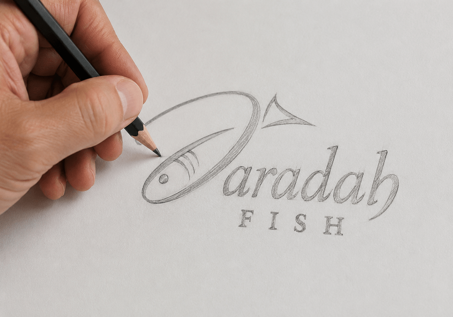
Early explorations focused on balancing simplicity with a recognizable fish form. Sketching helped refine the proportions and ensure the J-shape remained clear while still conveying the maritime theme. This stage was essential for establishing the visual logic behind the final symbol.
Brand Applications
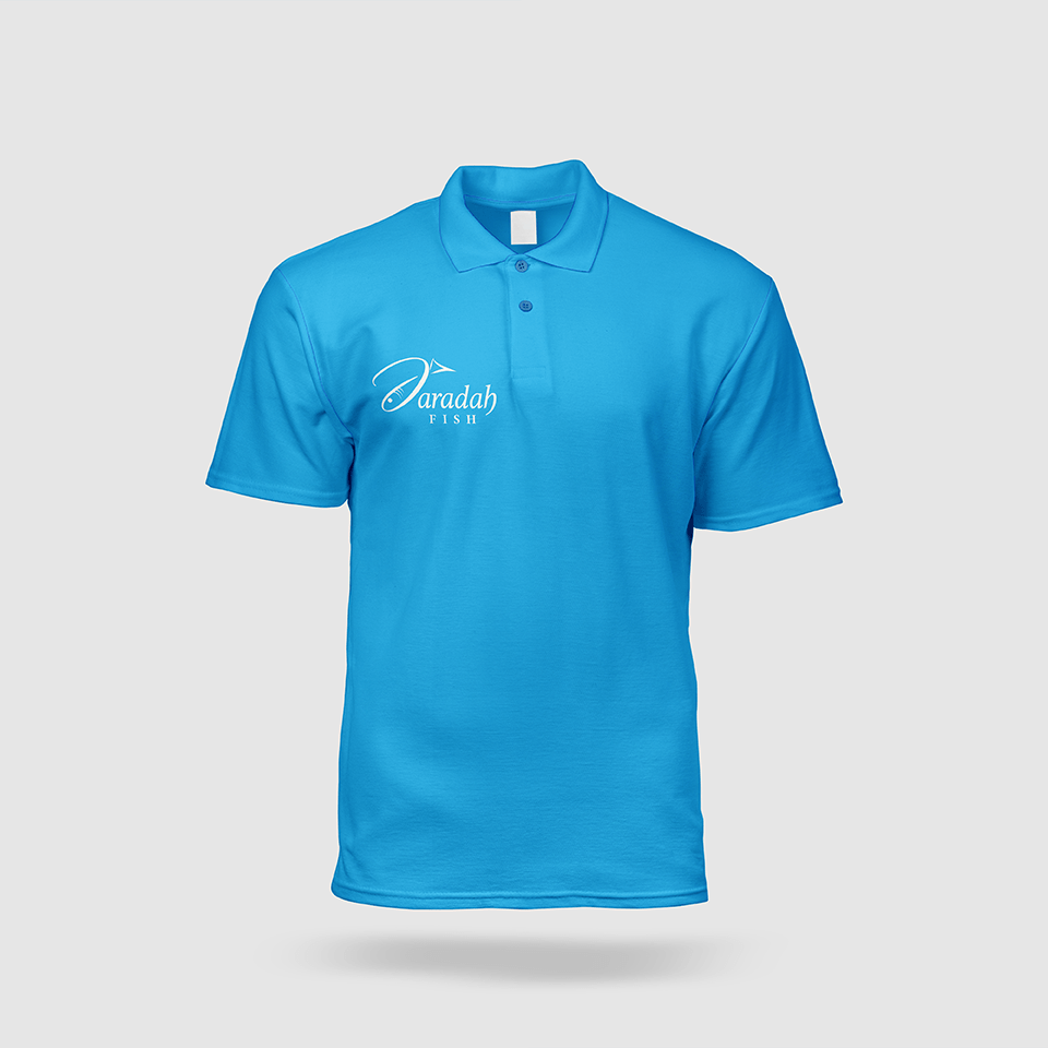
To demonstrate how the identity could extend across real-world scenarios, I developed a series of branded mockups - stationery, delivery van graphics, apparel and sketch-based concept visuals. These applications highlight how the brand system behaves in various contexts and how its visual consistency can be maintained across print, merchandise and digital environments.
The stationery system demonstrates how the identity maintains clarity in minimal layouts. Clean typography and balanced spacing help reinforce the brand’s professional tone.
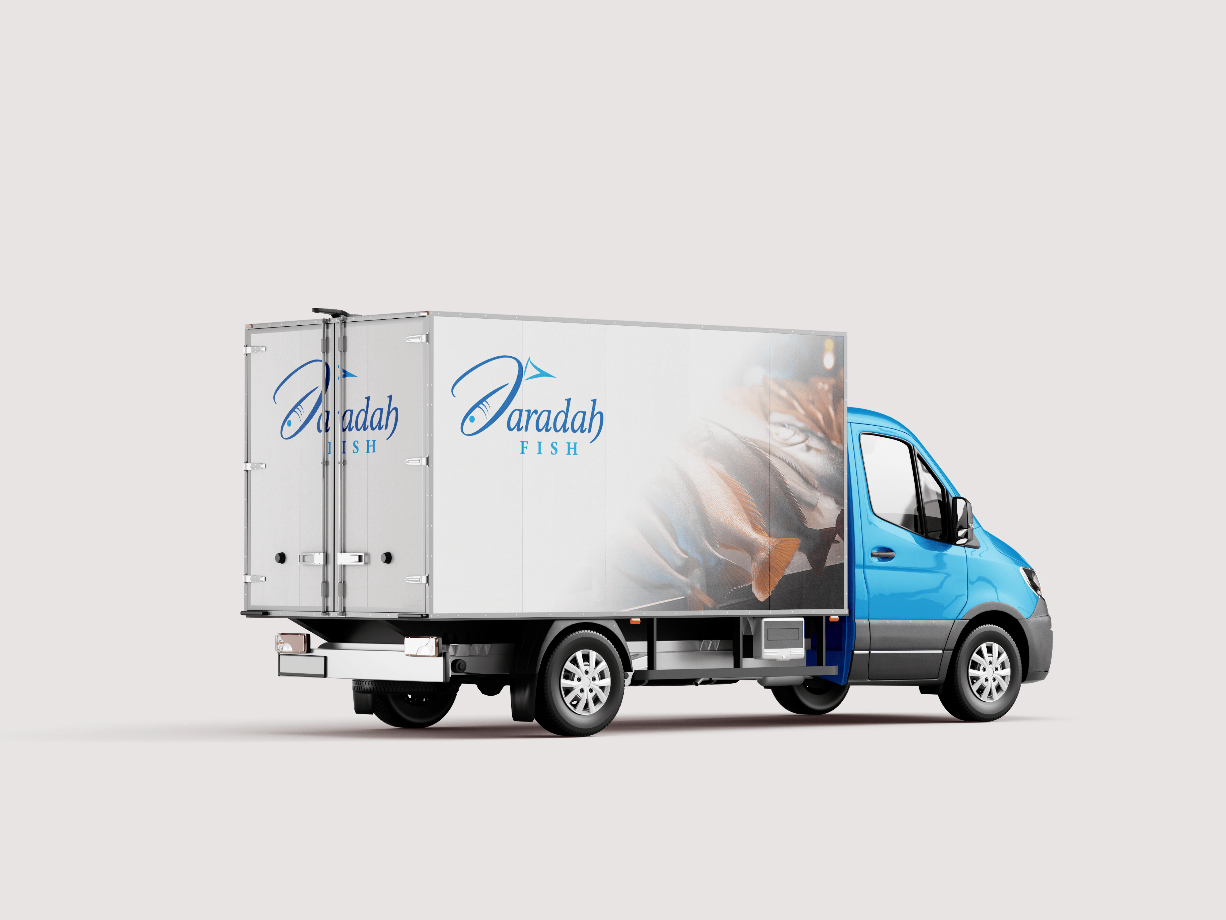
The delivery van mockup showcases how the logo scales to large formats while maintaining strong visibility and brand recognition.
Tone & Positioning
The branding direction focuses on reliability, freshness and professionalism - qualities essential for a company operating in the fish trade sector. The clean, minimal aesthetic ensures the identity remains timeless, adaptable and easy to implement across diverse materials, supporting long-term brand growth.
Technologies Used
Adobe Photoshop, Adobe Illustrator
This project is presented as part of my design portfolio to showcase conceptual branding work created for a client. Visual materials are displayed solely for demonstration purposes. The final branding and identity system created for this project became the property of the client and is used here only as a portfolio reference.